
Home › Discussions › Campaign Submissions › The "Review my Campaign" thread - Campaign Submissions Discussions on Obsidian Portal Community Forums

Howdy, Stranger!
It looks like you're new here. If you want to get involved, click one of these buttons!


Comments
This is my first OP campaign that I have really shared with anyone other then the players. It's also probably the most extensive one I've made. Full disclosure most of the NPC's don't have their stats filled in, but ussualy at the table we have a book that has all their stats so they don't need be on the portal for the backup reference, same for the players. Only people who have added their character stats on the portal page for them are people who know they aren't the best at brining their sheet.
https://asongoficeandfire.obsidianportal.com/dashboard
Here's mine, for your review:
http://nocturnumrebirth.obsidianportal.com/
Jason Vey
Nocturnum: Rebirth - Unisystem - Campaign of the Month, March 2017
Machinations of the Slave Lords - D&D 5
Hi Jason,
Don't have time right now for a complete review, but here are a couple quick suggestions.
On your main wiki page, I'd either delete or move the Player Reference section regarding the editing of the wiki. Odds are your players know how to edit the wiki by this point so you could delete it, but if not move it to a separate page with a link to it.
I'd also delete the welcome to the campaign adventure log as it.
You might want to put a copy of your opening credits video your front page to spice up that page.
One other suggestion, since you have a soundtrack picked out what might be cool is for your episode adventure logs (since they are fairly long) have a small soundcloud/youtube link to one of the songs that you think best captures the mood of that post. Also because some of the adventure logs (particularly the episode adventure logs) are long they could use images to break up the text
I'll post some more suggestions later.
They are among us!
XCom: Defiance - Campaign of the Month November 2016
Thanks for the tips! I've deleted Welcome to Your Campaign, moved "Updating the Wiki" to its own page, and added a copy of the opening credits to the front page. As I have time I'll go through the adventure logs and try to break them up, and add some YouTube links to spruce them up a bit as well.
Jason Vey
Nocturnum: Rebirth - Unisystem - Campaign of the Month, March 2017
Machinations of the Slave Lords - D&D 5
@falloutmind
1. Your main page needs some content, a quick summary or plot hook would do really. You want something there since it is the first page that nearly everyone viewing your campaign will see.
2. I love the content in your Episode One In-Depth Summary but the presentation needs help; the text seems too close together or maybe the blocks of text are too large, splitting that up would greatly increase legibility and add a bit of visual interest.
3. I like your character page, lots to look at and everybody has a distinct picture. Tagging the characters with their respective Houses may help people keep track of things.
GM of Rise of the Durnskald: Wrath of the Fallen Goddess - February 2016 CotM
GM of Core: The Ashes of Alcarna - April 2020 CotM
GM of Stream of Kairos
Need CSS Help? It may be covered here: Abersade's CSS Hub
Wow, seems like this thread really missed getting stickied....
Just trying to help out.
Yeah, this is one of those useful threads.
They are among us!
XCom: Defiance - Campaign of the Month November 2016
Hi folks!
It's been three years of complete redesigns and tweaking and endless "bug" hunting and I and my players are about to wrap up the campaign so I think it's time to ask you for some third-party feedback for God-Touched. Content organization, styling, font choice, specific bugs, something not to do with design or organization at all...
Also advice for how to fix aforementioned bugs is very welcome, although I think at some point I will go to the CSS forum to ask all official-like. There are a few things that I've kind of thrown up my hands in frustration over -- for example, the PCs' pages and how I can never get them to display the Attribute icons correctly, plus that ever-vexing overflow. (Also Ginger Wolfschlegelsteinhausenbergerdorff's sidebar info on her character page, but if that's non-fixable I will happily let it pass. I think it's appropriate given her personality.)
I've only ever viewed GT's site on Chrome and Firefox, so Safari, Edge, Explorer, Opera, etc. users be warned.
Also there is cussing and offensive language used in the logs and the quotes on the character pages, so probably don't look through it at work or something.
Looks great, but one of the issues i see is that in many places the only way to navigate away from a page is to hit the back button.
i'll take a look at the css issues, once i'm in front of a computer instead of an iPad. I'm guessing you want the PC page to have icons for the stats like the NPCs have.
I like the quotes on each character. Great idea.
They are among us!
XCom: Defiance - Campaign of the Month November 2016
Thanks! I'm glad you like the quotes. They're fun to pick out of the logs.
For the pages that lack navigation, are they mostly Rules-based and character pages? The Rules-based pages have navigation way at the bottom, but I acknowledge that's not stellar design.
The PC pages should have the icons like on the NPC pages, but they're shrunk too far down to be visible. I know that's because of the Fatebond bonuses and penalties squashing them but I've found no simple way to make those columns in particular have a smaller font size.
Aside from all that, how was it on the iPad? Was it readable? Did you have to drag from side-to-side to access all the content?
No as long as i had the ipad turned so they view was wide it looked good.
I know that safari can render quite differently than chrome and firefox. Case in point, the css solar system on my front page had the earth becoming flat as it rotated around the sun for firefox and chrome, but not safari. That was because safari ignored an error in my css, but firefox and chrome handled the error differently. So, i'll be interested in seeing your site in firefox tomorrow.
They are among us!
XCom: Defiance - Campaign of the Month November 2016
To fix the character sheets icons try adding !important to some of your css that you already have but that isn't taking effect. This should reduce the padding enough to let you see the icons.
try adding to max-width to char-sidebar td fix Ginger's overflow.
They are among us!
XCom: Defiance - Campaign of the Month November 2016
Like the lastest issue spiral, it works well.
Also, it was a good idea using a wiki page as your character list page instead of the one supplied by obsidian portal. Doing that really allowed you greater control on how the characters are displayed, and grouped while still being able to link back to the character sheets. Overall, I really like the campaign.
They are among us!
XCom: Defiance - Campaign of the Month November 2016
Thank you! Those fixes definitely worked and got me tweaking some more things. I'll go about adding navigation for the rules pages.
By the way, that's a pretty beastly front page your campaign has there! Is that all pure CSS?
Yeah, it is all pure css. A lot of rotations and counter rotations.
They are among us!
XCom: Defiance - Campaign of the Month November 2016
CGregory: do you post your campaign's CSS for other's to peruse? I'm looking at a rebuild of my character page, and there are some ideas from yours I'd like a closer look at.
You know.... to steal. ;-)
-bort
Campaign of the Year - 2018
Agreed that this thread is criminally underused and should be stickied. I think anyone nominating themselves for CotM should first post here for helpful, constructive critique. We have a lot of great sites on our radar so the nominees need all the help they can get. At least it can't hurt?
Also, I'm torn on a section on X-Com for cgreg's CSS -- it might up the awesome and wow factor of too many sites, making it harder for the committee to pick!
(That's me actually saying its a fantastic idea. You can't have too much of a good thing :)
~ JIM,

Campaign of the Month, September 2016
Here is my CSS
It is only partly commented, but if there are effects you want to know about just ask.
They are among us!
XCom: Defiance - Campaign of the Month November 2016
Thanks for sharing, CGregory. In the purge they not only took some valuable threads off sticky, but deleted some valuable advice- I hope that stuff can get restored.
Just trying to help out.
I'm tinkering. Again.
In the last session, the characters found a map of the entire layout of the vile Temple of the Ebon Hand, and I created this quick navigation setup to go along with the map digitally. I'm pretty happy with it, but wondering if there isn't a way to improve it yet further.
Any suggestions?
Ptolus, City by the Spire - 2016 Campaign of the Year
"Please pay attention very carefully, because this is the truest thing a stranger will ever say to you: In the face of such hopelessness as our eventual, unavoidable death, there is little sense in not at least TRYING to accomplish all your wildest dreams in life." - - Kevin Smith
Hi everyone,
Let me introduce you our (french) campaign "Les Compagnons d'Ailleurs", A d&d3.5's campaign : https://lescompagnons.obsidianportal.com
I'm not the GM, I'm just a player and I'm working on the website's design, so I would love to have your feedback / suggestion :)
Thanks guys!
Player of Les Compagnons d'Ailleurs - A d&d3.5 campaign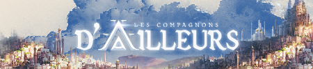
First, welcome to the boards oMiCid!
Your main wiki is awesome! Really well done.
Not a big fan of the overall color scheme.
Since most of OP is English speaking, I suggest putting in a translate button, as Pils did on his CotM winning Dark Sun campaign https://dark-sun-a-trova.obsidianportal.com/
Also would add pictures to your adventure logs.
Really good looking start- thanks for bringing it to our attention!
Just trying to help out.
I don't have a suggestion at the moment UselessTriviaMan, but I do have a comment, the session post you did looks great! I need to read through it completely and if I think of anything I'll let you know, but it looks really great!
Johnprime
Where the west is really wild!
The Valley of Life
OMG Gorgeous site OmiCid! I'll assuredly want to pick our brain for some of the custom CSS you have going here. Translation would be nice, but I don't think the language barrier would disqualify you if you chose to nominate the campaign for CotM.
~ JIM,

Campaign of the Month, September 2016
@abu_is_evil
Thank you for your comment, I've already started working on it. I transformed all my photos that contained text with TRUE text on it to be able to use Google translate later.
About pictures into the adventure logs, we only have it in 2 logs, but yeah i hope the team will continue in that way and make our adventures more attractive !
EDIT : @Jim_Mount thank you. i'm trying to improve it with all your feedbacksThanks again :)
Player of Les Compagnons d'Ailleurs - A d&d3.5 campaign
Well, i brought some modifications :
- I changed all my photos that contained text to put real text
- I added the Google translate's button on the homepage and the wiki main page
- I added some pictures on (almost) all the chronics.
What do you think about it, guys ?
Player of Les Compagnons d'Ailleurs - A d&d3.5 campaign
Outstanding work!
~ JIM,

Campaign of the Month, September 2016
Bump- still hoping for a sticky to this thread....
Just trying to help out.